Pick Up Limes
Website redesign

Project description
I finished the UX Design Bootcamp with a personal project of my choice. As I often search for new healthy recipes, I am a frequent visitor of the Pick Up Limes web page. On the page, you can find healthy and easy to make vegan recipes and articles. The dedicated YouTube channel has more than 3 million subscribers (Status: August 2020) and I am one of them 😄
The web page was created in 2017 as a simple blog but with time more content was added. I noticed that it takes too much time to find a certain recipe and important information to start cooking.
Duration
2 weeks
My role
Team
Tools
Researcher
UX & UI Designer
Me 😄
Figma
Miro
GlooMaps
Optimal Workshop
MS Excel
Project goals
Redesign the web page to be more efficient and easier to use. That way the page will also increase the number of frequent visitors.
Even though I didn't have contact with the web page owner Sadia, I kept in mind business goals based on my assumptions.
-
The main income comes from sponsors, YouTube channel, affiliate and referral marketing
-
She wants to grow her network also on the web page
Research
Research process
First I created a User Research Canvas to prepare myself for the user research. After I created the Interview & Usability Test script, I found 5 users that match my target group - women age 25 – 55 interested in healthy eating and who like to try out new recipes.

After the user research, I used an affinity mapping tool to analyze my research findings. I wrote down all of the main findings and grouped similar ones together. In the final step, I clustered main findings into four main problems that needed to be solved.
Key research findings
1. Search for the recipe is difficult
-
The double menu bar at the homepage is confusing, especially because of the different names (e.g. delicious recipes/recipe index)
-
Subcategories are missing (e.g. around 50 recipes in category “Meals” and no subcategories)
-
The users are not sure if the search function is only for the recipes or the whole page
2. Content on the recipe page is structured inefficiently
-
Important information (ingredients & preparation instructions) is reachable only after a longer scrolling
-
The decision for trying out the recipe is made based on the list of ingredients and a photo
-
The page needs to be more mobile-friendly because most users view the mobile version while cooking
3. The landing page does not give a correct first impression
-
New visitors assume the website is about cocktail recipes because there`s a big photo of the summer drinks on top of the screen.
4. The blog needs a more descriptive name and a new structure
-
The users are not sure what content they will find under the blog section. A more descriptive name needs to be found
-
Categories inside of the blog need to be redesigned
Ideation
To collect ideas I conducted a Product Inspiration Analysis to find out how other competitor pages solved these specific problems. I focused on what kind of navigation others have, what is their IA, how their search functionality works and how their recipe page is designed.
Card Sorting & Tree Testing
As the first step to the redesign of the Information Architecture I created a sitemap of the current page on GlooMaps. That way I got a better overview of the current page. In Excel I wrote a big part of the content (titles of recipes and articles) and clustered them in current categories. Based on this I created the first concept of a new sitemap. Because a user might think differently than me, I decided to make two Card Sorting tests on OptimalWorkshop.com. One was to test how the user would grouped recipes and articles, and the second one to test how the user would group different articles.

After I analyzed the results of Card Sorting I improved my sitemap and tested it with Tree Testing at OptimalWorkshop. To get statistically relevant data I would need at least 50 responses but due to time shortage and budget restrictions I was able to gather 10 responses. Nevertheless, this helped me to make additional improvements on the sitemap.
Sitemap Design Solution
-
All recipes are removed from the blog as they are already in the recipe section
-
“Recipe Index” is renamed into “Recipes” and “Blog” into “Articles”
-
A 2nd level of subcategories for the recipes was created. That way the user has a better overview and faster & easier navigation. During Card Sorting and Tree testing, I learned that some recipes needed to be in more than one subcategory. For example, one user sees a sandwich as a meal, the second user as a savory snack and the third one as breakfast.
-
Articles are structured into 3 new categories: Nutrition & Health, Lifestyle, Home & Beauty

Second level of subcategories for the recipes

Prototyping & Usability tests
I started with paper prototyping to create different solutions faster. After I decided which design solution I will use for the certain screen I created a Lo-Fi Prototype in Figma and checked it with usability tests. After I had the Hi-Fi interactive Prototype ready I conducted additional usability tests.
Prototyping Steps


Design Solution
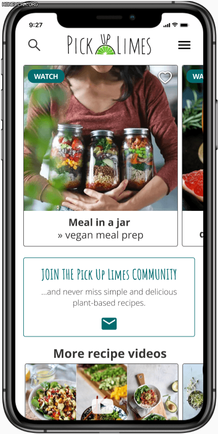
Home page
-
Fast access to the newest recipes and videos
-
More recipe videos are added directly on the page. Pick Up Limes is famous for its recipe videos. That way users have fast access to videos and on the other site Pick Up Limes will increase its number of views on YouTube.
-
The double navigation bar is removed
-
The header of the page is fixed. That way the user always has access to the search option and hamburger menu.


Navigation
-
Added subcategories of the recipes for the users who prefer to search for a recipe by using the navigation
-
Improved overview of the recipes with a smaller photo that helps users to see more recipes at the same time. I`ve added a navigation bar on top so the user can see his current position and go one or two steps back with one click
-
A new function was added - a list of favorite recipes. Users can easily access their favorite recipes when they need them. For this reason, I add a heart symbol to all recipes as well as the sign-up and log-in button that is needed to create a personal collection of recipes. That would be a good starting point to build the community even further directly on the website.


Search functionality
-
Added indication that a user can search for recipes or articles
-
User can search by ingredient
-
The search function offers a drop-down option with keywords when users start typing
-
Search results are grouped into two categories: recipes and articles. User can decide if he wants to see results that are a part of the recipes or articles

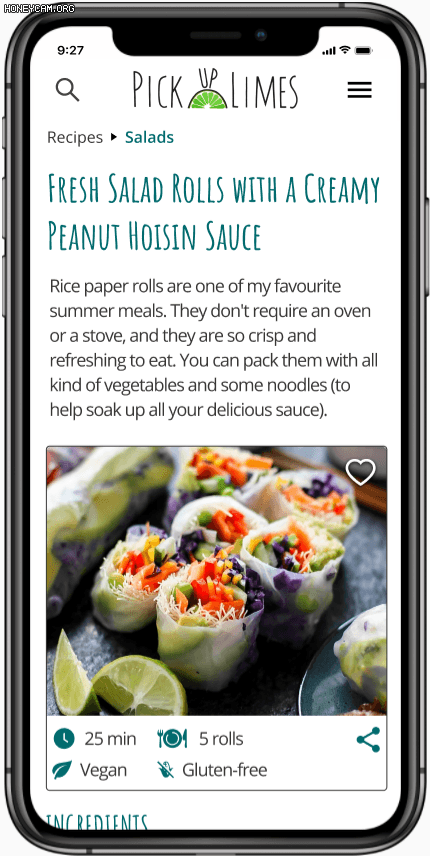
Recipe page
-
Users usually decide if they will try out a recipe based on the photo and ingredients. That’s why I've put this important information at the beginning.
-
Users often want to see preparation instructions only before they start cooking. That is why preparation instructions are hidden on the first view and can be unhidden with one click.
-
Font size and spacing have been optimized to create a user-friendly overview.
-
The video with the recipe is placed after the instructions because not every user watches the video before he starts cooking. With usability tests, I discovered that most users watch the video if the recipe seems complicated.
-
Users can see more photos of the dish with horizontal scrolling below the recipe.
-
At the bottom, user can write or read comments and see other latest recipes and articles

Reflection & Next steps
I have created a Pick Up Limes mobile web page Hi-fi mockup that is efficient and easy to use by
-
redesigning the sitemap and adding new subcategories
-
improved the navigation and search functionality to make it easier for the user to find a certain recipe
-
adding new functionalities that improve user experience
-
creating a new structure of the recipe page
How to create an efficient recipe page and sitemap was the most challenging part. I gained the most of my knowledge with different user testings and by analyzing the competitors.
Most of the users use their phone when searching for a recipe and also while cooking. That is why I first created a mobile web version of the page. Next step would be to develop a desktop version.